Interested in what we do?
Let’s have a talk, and see how together we can take your brand to the next level.

Non-Japanese speakers may find Japan a daunting place to travel in. Being in a place known for robots, katanas, high-speed trains, bicycles, neon lights and tranquil shrines can be a polarizing and confusing experience. Many of its citizens don’t speak English and commonly use a writing system that does not include the Roman alphabet. But thanks to the country’s visually-oriented culture that is highly evident in its urban planning, navigating its cities can be an uncomplicated, eye-opening process.
When I visited Japan in the spring of 2015 with Aqid, a respected colleague and at partner at Flipbox, and my younger brother, we managed to breeze through the trip without ever getting lost, despite having almost zero knowledge of the language. If Japan was a mobile operating system, it would be more iOS (which has hit the sweet spot yet again with iOS 9) than Android.
A solid navigation system takes you places quickly and efficiently
One of the most important aspects of user experience is the navigation system. A well-thought-out information architecture determines how easily and quickly a user can access information. When it’s intuitive and contextual, information is constantly adjusted and shifted based on the user’s objective – key ingredients for a seamless user experience.

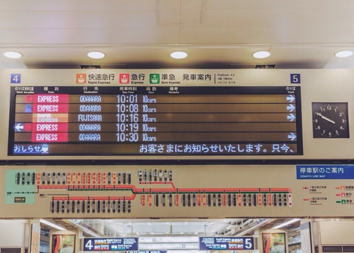
Every train station I went to in Japan had an abundance of information written in both English and Japanese to help commuters decide which train to take, which train will pass through and the exact time (down to the minute). If I had gotten on the wrong platform, these markings will direct me to the right one. All I had to do was look up.
They know your pain points and give you solutions
You may have had those nights when you’re starving at 3am and wondered if a particular food joint is still open so you launch Zomato on your phone and conveniently discover that it is, courtesy of a prominently positioned widget that says “OPEN NOW”. Or that time when you opened Uber after landing at the airport and it immediately recognized that you were in an airport, promptly suggesting meeting points for you to meet the driver.
Important, carefully-placed items in appropriate areas is a mark of good usability, and this was something I encountered daily in Japan. A memorable example was arriving in Osaka station to find a row of coin-fed luggage lockers right outside the platform and immediately reaching into my pockets to see if I have enough coins. I looked up to find a conveniently-placed sign on the wall that read: “Need change? Go to the kiosk →”.
Don’t get me started on the toilets
The toilet seats are always warm. Not because someone else had sat on it for a long time, but because the seats are actually temperature-controlled. Sitting down on a warm surface to do number two after spending the whole day outdoors in -10°C conditions is nothing short of a godsend. It may be the best human invention since sliced bread.
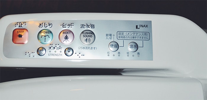
The brilliant minds behind these sophisticated, high-tech toilets are a considerate bunch – empathetic enough to come up with a way to drown out embarrassing noises. Pressing one of the many buttons on a dashboard on the side of the toilet seat triggers a flushing sound, without the actual flushing. Brilliant.

Getting around in Japan is like navigating a well-designed website. Its city planners and designers have made it easy for visitors who don’t speak the local language to accomplish what they set out to do by anticipating their problems and providing a solution.
We are crazy about user experience and obsessed about how best practices can be implemented in our works. If you’re as passionate as we are or have a real interest in the subject, schedule an appointment with us so we can discuss over some coffee.